Gdoc/Admin

Popular pages

Research and data to make progress against the world’s largest problems.

14,379 charts across 123 topicsAll free: open access and open source

Our Mission

What do we need to know to make the world a better place?

To make progress against the pressing problems the world faces, we need to be informed by the best research and data.

Our World in Data makes this knowledge accessible and understandable, to empower those working to build a better world.

Read about our mission

We are a non-profit — all our work is free to use and open source. Consider supporting us if you find our work valuable.

Donate to support us
As seen on
Logos of the publications that have used our content. From left to right: Science, Nature, PNAS, BBC, Financial Times, The New York Times, The Guardian, The Atlantic, and The Washington Post

Data Insights

Bite-sized insights on how the world is changing, published every few days.

See all Data Insights
The image presents a line graph illustrating the growth of electric cars in Norway from 2010 to a projected 2024. The title indicates that one-third of cars on the road in Norway are expected to be electric by 2024, with a specific note that electric cars encompass both fully battery-electric and plug-in hybrids, though recent sales predominantly feature fully electric models.

The vertical axis represents the percentage of electric cars, ranging from 0% to 35%. The horizontal axis denotes the years from 2010 to 2024. A bold brown line sharply rises, indicating growth, reaching 32% in 2024. Accompanying annotations highlight that in 2019, the percentage was 12%, and in 2014, it was just 1%. 

Additionally, the graph includes lines representing electric car adoption rates in other countries, specifically Sweden, China, the UK, the USA, Japan, and the global average, shown in lighter shades of gray. 

The data source at the bottom reads: "International Energy Agency. Global EV Outlook 2025." The graph is licensed under Creative Commons Attribution (CC BY).

One-third of cars on the road in Norway are now electric

Norway is leading the way in the transition from petrol to electric cars. Almost every new car sold in Norway is electric. Hardly anyone buys a combustion engine car anymore.

However, data on new car sales doesn’t tell us about the distribution of cars on the road. There is a lag between sales and stocks, because people can hold on to their existing petrol and diesel cars for as much as a decade or more.

But after years of electric cars dominating the market, one-third of cars in use in Norway are now electric. The chart shows this growth.

The share was only 12% five years earlier, which shows that this transition can happen relatively quickly.

As the global leader, Norway’s experiences can help to inform other countries on factors like charging networks, grid management, and the impacts of electric car uptake on emissions and air quality.

See how common electric cars are in other countries across the world

Continue reading
A line graph titled "Cereal yields in England and globally" illustrates the yields of wheat and barley over time, measured in tonnes per hectare. The horizontal axis represents the years from 1275 to 2023, while the vertical axis indicates yields ranging from 0 to 8 tonnes per hectare. 

Shown are wheat yields and barley yields in England and the global average.

Today's yields in England are approximately ten times higher than in the 16th century. Globally, yields have increased three-fold in the last six decades. 

The data sources cited at the bottom are "Broadberry et al. (2015), FAO, and others".

Rising yields, falling hunger

The Agricultural Revolution — the transition from hunting and gathering to farming — didn’t end hunger. That’s because more food didn’t mean more per person: it meant more people.

The English cleric Thomas Malthus predicted this would continue forever: food production would always be outpaced by population growth, making lasting progress against hunger impossible.

But at least since the mid-20th century, England has left mass hunger behind. How was this possible? How did English farmers prove Malthus wrong?

The chart shows one central part of the answer. For centuries, cereal yields in England — for staples like wheat and barley — were stuck at about 0.6 tonnes per hectare. That means farmers needed a plot of 100 meters by 100 meters to grow 600 kilograms of cereals per year. Hunger was widespread.

But this changed from the 17th century onward, accelerating a hundred years ago. In a dramatic transformation known as the Second Agricultural Revolution, farmers found ways to grow much more food on the same land.

Today, after four centuries of rising productivity, English farmers are growing about ten times more food on the same land than in the past. This has made it possible to increase food production faster than population growth, breaking England out of the “Malthusian Trap”.

The chart also shows that the world as a whole is changing in the same direction. Global average yields have tripled in the last six decades. Today, yields are already about five times higher than in England in the past. If yields continue to follow this trajectory, it would bring us much closer to the end of global hunger, while also sparing land for nature.

My colleague Hannah Ritchie wrote about how climate change might affect crop yields in the future

Continue reading
A line graph illustrates the trend of new HIV infections in children from 1990 to 2023. The vertical axis represents the number of new HIV cases, ranging from 0 to 600,000. The horizontal axis represents the years, spanning from 1990 to 2023.

In 2000, the peak shows 530,000 new HIV cases in children. A highlighted area, labeled "New infections averted due to PMTCT," indicates the number of cases prevented each year, demonstrating a gradual decrease in infections since then. The lowest section of the graph, colored in dark purple, represents the actual new HIV infections in children, while the upper section reflects infections prevented through prevention methods. An annotation notes that 230,000 cases are prevented each year due to these treatments.

The data source is the Joint United Nations Programme on HIV/AIDS, referencing 2024, with a copyright attribution of CC BY.

Every year, 230,000 children are spared from HIV thanks to treatments that reduce mother-to-child transmission

It’s hard to imagine many things that are more terrifying than your baby contracting HIV. This is the reality for around 130,000 families every year.

Just a few decades ago, this figure was over half a million. Most of these infections were passed on from mothers who had HIV themselves.

But the introduction of anti-retroviral (ART) drugs and other interventions has meant that most infections can be prevented. If the mother takes ART during pregnancy, it dramatically reduces the risk of passing on HIV. In some cases, giving ART to the baby in the first few weeks of life can help too.

In the chart, you can see this decline in new HIV infections in children. On top, you can see the huge number of cases estimated to have been averted thanks to these interventions; they amount to almost a quarter of a million cases every year.

Explore more of our work on HIV/AIDS in adults and children

Continue reading
The graph illustrates the trend of trade as a percentage of GDP for China, the United States, and Germany from 1970 to 2023. 

China's trade as a share of GDP, represented by a thick brown line, starts at around 5% in 1970, increases steadily to approximately 64% around 2010, and then declines to 37% by 2023. 

In contrast, the United States, shown with a thin gray line, exhibits a more stable trend, beginning below 20% in 1970 and rising slightly to around 30% in 2023. 

Germany's trade as a share of GDP follows a varying path, starting near 45% in 1970, climbing to nearly 80% by 2023, and showing notable fluctuations throughout. 

Key data sources for this information include the World Bank and OECD, with a projected update scheduled for 2025. The visualization is licensed under CC BY.

Trade plays a much smaller role in China's economy than it did a few decades ago

Global trade has never been a bigger slice of the world economy. However, China, the country that most people think of as the export giant, has seen a decline in its trade-to-GDP ratio in the last 15 years.

The chart shows China’s trade in goods and services as a share of its Gross Domestic Product (GDP). In 1970, it was just 5%. Following Deng Xiaoping's economic reforms, which opened China to market forces and international trade, this figure soared to 64% in 2006. But since then, it has fallen considerably, reaching 37% in 2023. China's exports have grown in dollar terms, but its economy has expanded even faster, making trade a shrinking share of the whole.

While the 2008 financial crisis disrupted global trade, China’s trajectory also reflects the increase in domestic demand for its production. For years, Chinese officials have advocated rebalancing the economy away from export dependence and toward one driven by domestic consumption. A rising middle class now buys more of what China produces, reducing its reliance on international markets.

Explore more data on our Trade and Globalization page

Continue reading
Chart showing that in Zambia, Malawi, Mozambique, and Madagascar, the majority of people live in extreme poverty and poverty has not declined in the last decades.

Extreme poverty has not declined in these four Southern African countries

Globally, the share of the population living in extreme poverty has declined fast, from 38% in 1990 to 9% in 2024.

Some countries, however, have not made any progress against poverty. Four of them are in Southeast Africa, as shown in the chart. In Zambia, Malawi, Mozambique, and Madagascar, most people still live in extreme poverty, and this hasn’t changed in decades.

Poverty has remained high because these economies have not achieved economic growth in recent decades.

In the 1990s, most extremely poor people lived in countries that went on to have strong economic growth. Today, however, a substantial share of the poorest people live in economies that have not grown in decades. Based on current trends, this means that the world cannot expect an end to extreme poverty.

Whether or not the economies that are home to the poorest people in the world start to grow will determine whether the world ends extreme poverty.

I’ve written more about this in “The history of the end of poverty has just begun”, where I explain why economic growth is key to ending poverty →

Continue reading
The image illustrates a line graph depicting suicide rates in Sri Lanka from 1980 to 2021. The y-axis represents the estimated number of suicides per 100,000 people, ranging from 0 to 50, while the x-axis indicates the years. 

A dark brown line shows the trend of suicide rates in Sri Lanka, starting above 40 deaths per 100,000 in the late 1990s and declining significantly to approximately 15 deaths per 100,000 by 2021. A light blue line represents the global average suicide rate, which remains comparatively low throughout the years.

Annotations in the graph indicate that Sri Lanka had one of the highest suicide rates in the world during the late 1990s, and although rates have fallen, they are still higher than the global average. 

The data source is listed as the Institute for Health Metrics and Evaluation, Global Burden of Disease, 2024, and a note clarifies that the metric is age-standardized for comparison purposes.

Suicide rates in Sri Lanka have fallen by almost two-thirds since the late 1990s

In the late 1990s, Sri Lanka had one of the highest suicide rates in the world: three times the global average and four times the rate in countries like the United States or the United Kingdom.

The most frequent method of suicide was self-poisoning, particularly from pesticides.

But since then, suicide rates have fallen by almost two-thirds. You can see this in the chart.

The biggest driver of this improvement was the banning of particularly toxic pesticides. Two highly hazardous pesticides were initially banned in 1984, and five more were banned in 1995. This slowed the growth in suicide rates, and the trend eventually turned the corner into a strong decline.

Sri Lanka’s experience in the last few decades makes it clear that suicide rates are not “fixed” at a particular level, and there are things that can be done to reduce them.

Suicide rates have declined in many countries over decades: read our insight

Continue reading
A world map focusing on Sub-Saharan Africa, illustrating electricity access percentages for Africa in 2022. Various shades of brown and orange represent the levels of electricity availability, ranging from less than 10% to over 70%. 

For example: In Chad, only 12% of people have access. In the Democratic Republic of Congo — a country of over 100 million people — it's just 22%. In contrast, in Kenya more than 75% of people now have access to electricity

A title indicates that less than one-in-four people have electricity access in parts of this region, and a note defines electricity access as having the ability to provide basic lighting and charge devices for at least four hours a day. At the bottom, there is a data source attribution to the World Bank for the year 2022. The image is credited to Our World in Data with a Creative Commons license.

A vast majority of people still lack access to electricity in parts of Sub-Saharan Africa

How many hours have you used electricity today? For me, it’s probably all of them — from charging my phone overnight to working on my laptop, exercising with my watch, and listening to music through my earphones. It's so normal that I can't imagine life without it.

But life without electricity is a reality for millions in Sub-Saharan Africa. This map shows the share of people with access to electricity across the region. This is defined as having a source that can provide basic lighting, charge a phone, or power a radio for just 4 hours daily.

Look at the countries in dark red: in Chad, only 12% of people have access. In the Democratic Republic of Congo — a country of over 100 million people — it's just 22%. Overall, 85% of people worldwide who lack access to electricity now live in Sub-Saharan Africa.

There are bright spots, though. Countries like Kenya, where more than three-quarters of people now have electricity, show that progress in the region is possible.

Explore more data on access to electricity

Continue reading

Get Data Insights delivered to your inbox

Receive an email from us when we publish a Data Insight (every few days).

By subscribing you are agreeing to the terms of our privacy policy.

Explore our data

Featured data from our collection of 14,379 interactive charts.

See all our data

What share of children die before their fifth birthday?

What could be more tragic than the death of a young child? Child mortality, the death of children under the age of five, is still extremely common in our world today.

The historical data makes clear that it doesn’t have to be this way: it is possible for societies to protect their children and reduce child mortality to very low rates. For child mortality to reach low levels, many things have to go right at the same time: good healthcare, good nutrition, clean water and sanitation, maternal health, and high living standards. We can, therefore, think of child mortality as a proxy indicator of a country’s living conditions.

The chart shows our long-run data on child mortality, which allows you to see how child mortality has changed in countries around the world.

Explore and learn more about this data

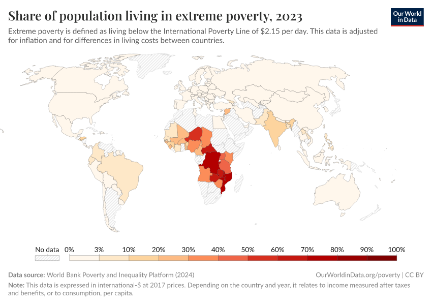
Share of population living in extreme povertyWorld Bank

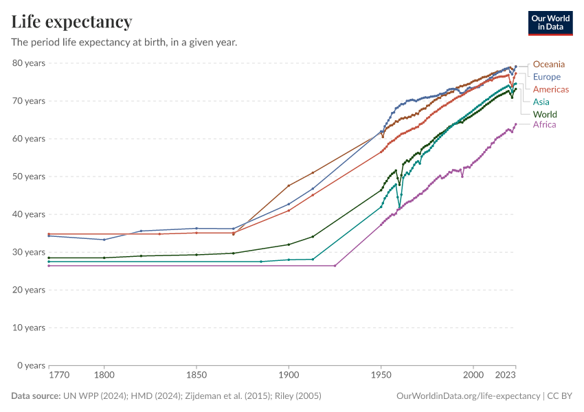
Life expectancy at birthLong-run estimates collated from multiple sources by Our World in Data

CO₂ emissions per capitaLong-run estimates from the Global Carbon Budget

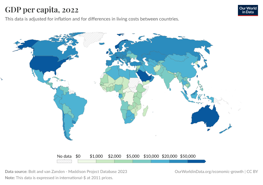
GDP per capitaLong-run estimates from the Maddison Project Database

Share of people that are undernourishedFAO

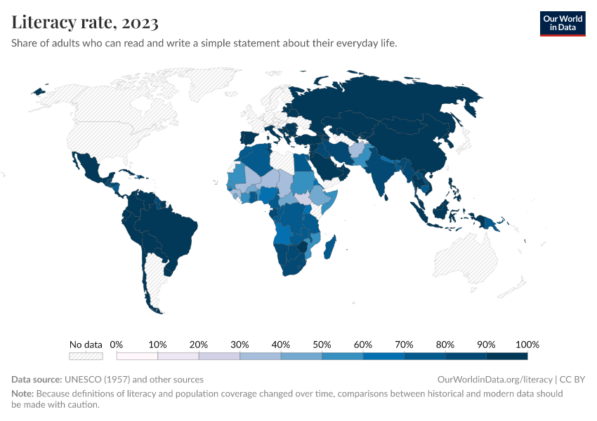
Literacy rateLong-run estimates collated from multiple sources by Our World in Data

Share of the population with access to electricityWorld Bank

Data explorers

See all our Data Explorers

Interactive visualization tools to explore a wide range of related indicators.

Subscribe to our newsletters

Receive our latest work by email.
By subscribing you are agreeing to the terms of our privacy policy.

All our topics

All our data, research, and writing — topic by topic.

Population and Demographic Change

Health

Energy and Environment

Food and Agriculture

Poverty and Economic Development

Education and Knowledge

Innovation and Technological Change

Living Conditions, Community and Wellbeing

Human Rights and Democracy

Violence and War